
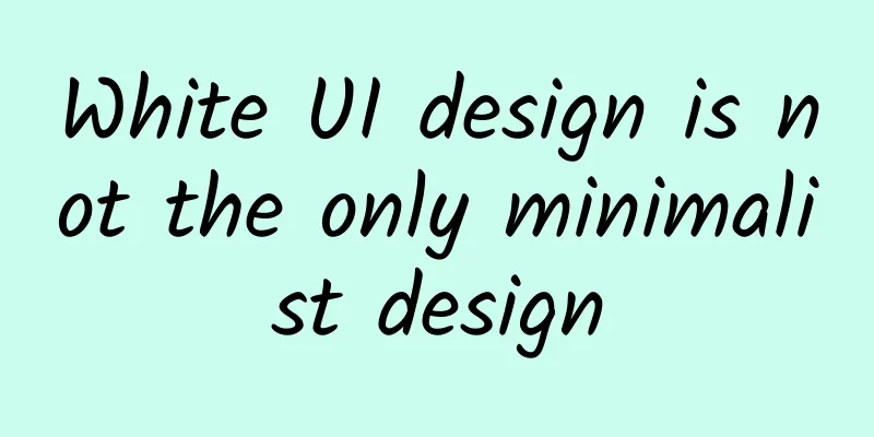
White UI design is not the only minimalist design
|
Since the products of several Internet companies have led the trend of white and simple design, now in China, if the design does not use white, it cannot be called a good design. We open all the applications, from entertainment to reading, to social tools to backup tools, etc., everything is white. In this issue, let's brainwash ourselves and look at the excellent foreign designs with other colors. Designer : Ludmila Shevchenko The entire interface is rich in color, and using multiple colors to distinguish each block can ensure the unity of color visual blocks. Designer : Javi Pérez The design is soft in color, and the dark colors further highlight the halo of white and purple, as well as the reading of text. Designer : Olia Gozha The color matching in the picture can be said to be very well grasped. A little more would make it bright, and a little less would make it dirty. Designer : Balraj Chana The combination of light purple-red and dark purple is a very popular color combination at present. Note that the dark part is not pure black, but has a purple tone. Designer : Eddie Lobanovskiy Dark colors can also be changed using different color levels, which can better distinguish the light and dark. Designer : Anton Aheichanka We say that there should be primary and secondary colors in the design, and the color values need to be consistent. Whether it is a button or a small note date prompt, it must be unified and consistent. #p# Designer: Cuberto The blurred wallpaper is to better set off the colors and the transparent white provides a better experience for the entire visual experience. Designer : Jakub Antalík The two colors can not only be used as the main colors, but the gradient colors between them can also be used in the entire design. Designer: SFCD The combination of purple and dark colors is a very high-end color and is very popular among the public, including high-end designers. Designer : Julien Renvoye Data statistics display applications prefer dark colors because they can display the data more clearly. Designer : Yura Yarokhovich The detailed timeline and small icons are one of the highlights of dark icons. If you don’t control the graphics well, you won’t be able to do dark design easily. Designer: Jona Dinges The color scale is used to represent the weather, which is a little gloomy but straightforward. Designer : Vasjen Katro The light and dark contrast of the guide page can better guide the user's visual center, unlike the white design that is easily scattered. |
<<: How to Become a Great JavaScript Programmer
>>: How to improve the game's user experience on the server side


Recommend
True high-quality watering: When irrigation meets high-tech
In order to ensure the country's food securit...
Pregnant women eating hawthorn may cause miscarriage? What prejudices do you have about hawthorn?
gossip In autumn and winter, there is a kind of f...
Russian hackers exploit Windows vulnerability to conduct espionage
Russian hackers are exploiting vulnerabilities in...
A new breakthrough in supersonic flight! Will “Somersault Cloud” open a new era of aviation?
Author: Li Chuanfu Shi Xiangqi On December 17, 20...
How to awaken the product’s communication power? Share 6 methods!
Once the product is made, the big challenge is ho...
How Weibo red envelopes replicated the magic of the Ice Bucket Challenge
Red envelopes are given out every year, but this ...
Nvidia's financial report: Nvidia's sales soared 23% in Q4 2023, becoming the world's largest semiconductor supplier
Thanks to the unprecedented demand for artificial...
5 links to sort out the B-side product operation framework
Currently, many companies that develop B-side pro...
More than 80 ducks were eaten for lunch! Why is the roast duck in the Olympic Village so popular?
Expert of this article: Pa Lize, chief physician ...
What are electronic anklets? How do they work?
Meng Wanzhou finally returned to China after bein...
Facebook low-cost traffic generation skills!
Marketers often look for ways to get more Faceboo...
91 Ten Articles - New Energy Vehicle Industry Briefing: 1,000 km range will be a reality by the end of next year
1. Fuyao Glass's annual report shows that the...
Recommend some keys to improve iOS development efficiency
First of all, the title is a bit broad. This arti...
How to make products to stimulate users' desire to spread the word?
In the era of social dividends, the reason why th...