
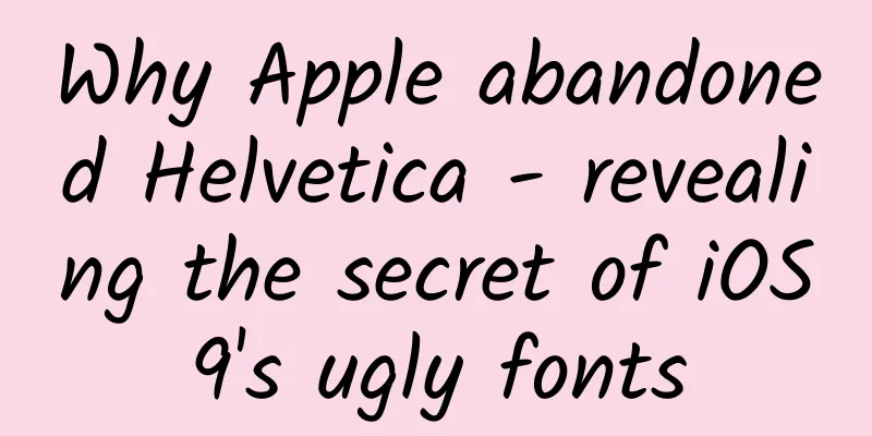
Why Apple abandoned Helvetica - revealing the secret of iOS9's ugly fonts
|
Since the first iPhone, Apple has used Helvetica as the system font. Why did Apple abandon Helvetica? It is the most popular font in the world. iOS 9 is now publicly released. It brings some subtle changes, but the system font of iOS 9 has become Apple's new San Francisco font, replacing the previously used Helvetica Neue. Helvetica (top), San Francisco (bottom) The San Francisco font has previously been used in Apple Watch, and now it has become the unified font for all Apple platforms: Apple Watch, iPhone, iPad and Mac. Since the first iPhone, Apple has used Helvetica as the system font. And since 10.10 Yosemite, the Mac OS X system font has also changed from Lucida Grande to Helvetica. Why did Apple abandon Helvetica? It is the most popular font in the world. Helvetica is too delicate at small sizes It is said that Helvetica is not suitable for small fonts. When the Mac OS X Yosemite system font was changed to Helvetica, many designers claimed that Helvetica was not suitable. “Helvetica sucks,” says Erik Spiekermann If you type in Helvetica text at a small font size, you will find that the readability is very low and it appears blurry. Some words overlap and are difficult to recognize. It is said that Apple designed the San Francisco font to make small text easier to read on the Apple Watch. Small letters overlap But nowadays, the resolution of small screen devices is higher than that of printed matter, and the text in the iPhone is not as small as that in the Apple Watch. Why did Apple change the system fonts of iOS and Mac OS X instead of just using them for the Apple Watch? San Francisco is more than just a font The San Francisco font has many highly readable features. The San Francisco font on Apple Watch and iOS/Mac are actually different. The font family "SF" is used for iOS/Mac, while "SF Compact" is used for Apple Watch. The difference can be seen in the rounded letters such as "o" and "e". The vertical lines of SF compact are flatter than those of SF. SF and SF Compact This difference allows the SF Compact text to have greater spacing, making it more readable on a small device like the Apple Watch. Moreover, SF and SF Compact are divided into two sub-font families, called "Text" and "Display". This is what Apple calls "visual size". Text fonts are used for smaller text, and Display fonts are larger. San Francisco Font Family As I mentioned before, in non-serif (or sans serif) fonts like Helvetica, two adjacent letters "overlap" each other, and letters like "a", "e", and "s" look similar at small font sizes. Display and Text fonts The San Francisco Text font, used at small sizes, is designed to have a wider kerning than the Display font. The Text font also has a larger weight for readability on small screens. San Francisco font is dynamic One of the main features of the San Francisco font is that it dynamically organizes text. The system will automatically switch between Display/Text fonts according to the font size. Specifically, 20pt is exactly this limit. Designers and developers don't have to worry about which font to use. For example, if you set the system default font for UILabel, the system will choose the appropriate text for you. One thing that really impressed me about the San Francisco font is the way the colon (:) is displayed. Normally, the colon is placed right on the baseline, so when it is placed between numbers, it is not vertically centered. In the San Francisco font, it is automatically vertically centered. Vertically centered colon San Francisco is a font made for the digital age As you can see, the San Francisco font has been carefully designed to be easy to read at any size and on any device. Helvetica, which was replaced by San Francisco, was created in Switzerland in 1957, when there were no electronic devices. Even today, Helvetica is widely used by many companies as a corporate font, and there is no doubt that it will be used as a great classic font in the future. San Francisco, on the other hand, is a modern font. It changes words dynamically based on the context. It’s a “digital native” font for the digital age. |
<<: What are the “invisible hands” driving those unicorns onto the path of mergers?
>>: Android 6.0 devices are required to enable full disk encryption


Recommend
NetQin's Q1 net income increased by 11.8% year-on-year, and its entertainment business has begun to show results
In the early hours of this morning, NetQin offici...
Molang Blender 3D assisted painting design process October 2019 [HD quality with material]
Molang Blender 3D assisted painting design proces...
Why do we become more irritable towards people we are closest to? The truth behind this is…
This article was reviewed by Dr. Tao Ning, Associ...
World premiere! Qualcomm Snapdragon 845 performance test: tops the charts without a doubt
At the Qualcomm Snapdragon Technology Summit in D...
The three laws of traffic products
Why can Waipojia’s Mapo Tofu be sold for as low a...
After using iOS 15, I am sure Apple has no solution
After looking forward to it for a long time, Appl...
Volkswagen is still in trouble after cutting 30% of its software department employees. Porsche turns to Google for breakthrough
On October 31, Porsche announced that future bran...
Tesla is accused of abandoning its electric car business
Founded in 2003, Tesla has become a leader in the ...
A complete set of activity operation planning and promotion ideas
The product is like a singer, and the operation i...
How did Meilishuo become a dark horse in entertainment marketing?
In a world where time is fragmented and consumer ...
New research: What does yeast eat to grow well? The answer is "wood"?
Produced by: Science Popularization China Author:...
Integrate map support in Android applications based on MapBox
one, Introduction MapBox is an open source vector...
Why do household brands continue to advertise?
Why do many household brands continue to advertis...
A 7-step case study to help you understand the entire planning process of Apple’s classic advertisement
If you are an ordinary person and you hate advert...
Apple iOS 15 officially released: new notification interface and FaceTime, big improvements to weather, photos, and wallet
June 8 news: Early this morning, Apple held the W...