
It’s that simple to adapt web pages to iPhoneX

|
iPhoneX has removed the physical buttons and replaced them with a small black bar at the bottom. This change has caused awkward screen adaptation issues for web pages. For web pages, the browser has already dealt with the adaptation issues of the top (bangs), so we only need to focus on the adaptation issues of the bottom and the small black bar (i.e. the common bottom-sucking navigation, return to top and other elements with fixed positioning relative to the bottom). The author has consulted some official documents and combined some processing experience in actual projects to organize a simple adaptation solution to share with you. I hope it will be helpful to you. The following are the effect pictures before and after processing: Several new things you need to know before adaptation Safe Area The safe area refers to a visible window range. The content in the safe area is not affected by rounded corners (corners), bangs (sensor housing), and small black bars (Home Indicator), as shown in the blue area in the following figure: In other words, if we want to adapt well, we must ensure that the visible and operable areas of the page are within the safe area. For more detailed instructions, refer to the document: Human Interface Guidelines - iPhoneX viewport-fit A new feature of iOS 11. In order to adapt to iPhone X, Apple has extended the existing viewport meta tag to set the layout of the web page in the visible window. Three values can be set:
Note: The default behavior of a web page without adding extensions is viewport-fit=contain. To adapt to iPhoneX, you must set viewport-fit=cover. This is a key step in adaptation. For more detailed explanation, refer to the document: viewport-fit-descriptor constant function A new feature of iOS 11, a CSS function of Webkit, is used to set the distance between the safe area and the border. There are four predefined variables:
Here we only need to pay attention to the safe-area-inset-bottom variable, because it corresponds to the height of the small black bar (the value is different for horizontal and vertical screens). Note: When viewport-fit=contain, the constant function does not work and must be used with viewport-fit=cover. For browsers that do not support constant, the browser will ignore it. The official documentation mentions that the env function will soon replace the constant function, but I have tested it and it is not available yet. For more detailed instructions, refer to the document: Designing Websites for iPhone X How to adapt After understanding the above-mentioned knowledge points, our next adaptation idea will be very clear. Step 1: Set the layout of the web page in the visible window Add the viweport-fit property to make the page content completely cover the entire window:
As mentioned before, the constant function can only be used if viewport-fit=cover is set. Step 2: Limit the main content of the page to the safe area This step is selected according to the actual page scenario. If this value is not set, there may be a situation where a small black bar blocks the upper part of the page content.
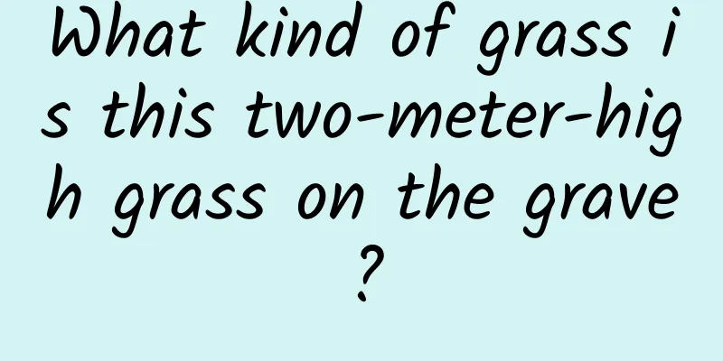
Step 3: Adaptation of fixed elements Type 1: fixed completely absorbs the bottom element (bottom = 0), such as the two cases in the following figure: You can extend the height by adding padding:
Or use the calculation function calc to cover the original height:
Note that this solution requires that the bottom strip must have a background color, because the background of the extended part follows the outer container, otherwise hollowing will occur. Another solution is to add a new element (an empty color block, mainly used to occupy the height of the small black bar), and then the bottom element can be adjusted without changing its height, just need to adjust its position, like this:
Empty color block:
Type 2: fixed non-complete bottom absorption elements (bottom ≠ 0), such as "Back to Top", "Side Ads", etc. In this case, only the position needs to be adjusted upwards, which can be handled only by the margin:
Alternatively, you can also overwrite the original bottom value by calculating the function calc:
Don’t forget to use @supports At this point, we have learned about the two common types of fixed element adaptation solutions, but don’t forget that we usually only need to add new adaptation styles for iPhoneX. We can write styles with @supports like this:
|
<<: Android mobile chip rankings released, Snapdragon 835 is not number one!
>>: Android skinning principle and Android-Skin-Loader framework analysis


Recommend
Those who line up in advance to buy iPhone 6 are not "Apple fans"
Although there are still two weeks before the off...
6 ways to attract traffic and monetize private communities!
Private domain operations have gradually become a...
3 tips to tell you why your advertising is not effective!
This is an era of information bombardment, and al...
The person who discovered the most chemical elements in history is a poet
Humphry Davy was not only a romantic poet, but al...
JingChi Technology and Guangdong Unicom cooperate to build a joint innovation laboratory for L4 autonomous driving 5G
On September 26, autonomous driving startup JingC...
What is China's national flower? Do the red beans in red bean smoothie represent lovesickness? Let's take a look at the secrets of plants
What is China's national flower? Do the red b...
The four most common types of pimples on the hands, face, and neck may not be ordinary skin diseases!
When it comes to HPV (human papillomavirus), dise...
The mobile video landscape is beginning to emerge. What are the secrets behind the unicorns?
In the investment field, startups with a valuatio...
An article to show you 20 new changes in iOS 12 Beta 5
A few days ago, Apple released the iOS 12 beta 5 ...
Why has Tiktok become the public enemy of American social media?
In the eyes of mainstream American social media, ...
How to calculate the cost of renting a server data center rack?
IDC data center business is flourishing all over ...
I don’t understand the recommendation mechanism of the video account. How can I increase my followers and realize monetization?
For creators who want to make their video account...
Why are there so many different flight configurations for helicopters? What are their characteristics?
Compared with fixed-wing aircraft, helicopters ca...
Why do I always feel my heart pounding?
Oops, I feel excited again! In life, many people ...
Fake traffic in channels is rampant---How can operators develop a keen eye?
In 2017, the mobile Internet was a turbulent sea....