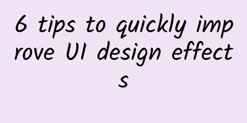
6 tips to quickly improve UI design effects
|
Editor's note: When designing a UI, there are many tips that can improve the visual effects and user experience of the interface. This article from Mark Andrew sorts out 6 very practical tips for improving UI effects. When creating a practical, accessible, and visually appealing UI interface, most of us only need to make limited fine-tuning to achieve pretty good results. 1. Grids and rules can be broken when it comes to typographyUsually when we design UI, we can quickly achieve good layout effects by using grid system and proportional layout. However, in many practical situations, text layout completely relies on grid system, which makes people feel a little uncomfortable and unnatural. At this time, it is important to note that the rules are not set in stone. At this time, you should break these rules appropriately and use your eyes to perform optical alignment instead of blindly following the layout. 2. Form error information must be accurate and easy to understandWhen designing a form, simply telling the user that there is an error here will not help the user solve the problem better. Usually you need to tell the user why it is wrong and how to correct these errors. For example, when the user fills in an incorrect email address, you need to tell the user whether it is "incorrect format" or "the address has been registered". At this time, the correction has a clear direction. 3. During the loading process, display the interface layout in advanceMany user interface layouts are usually relatively fixed. During the loading process of the interface, showing the layout to the user in advance can help the user build initial expectations and let the user know that the interface is loading rather than an error. Visibility of system status is thus presented, which is also in line with basic design principles. 4. Tell users the possible consequences of an actionThe results of many operations in the UI may be fatal, such as the delete operation. At this time, the result of this operation needs to be presented in the interface to tell the user that certain results may occur after this operation, helping the user understand the severity of the operation. Such optimization can help users better understand the functions and operations of specific buttons, ensuring a better product experience. 5. Make sure the most important features are prioritized first in the tab barToday's products are becoming more and more bloated with more and more functions. At this time, you need to be particularly careful about how to arrange the content in the tab bar. Reserve the front position of the tab bar for the most commonly used function modules, and hide the less important or less frequently used function modules in "More", which will make the interface easier to use. 6. Don’t hide important actions in drop-down menusWe still encounter the situation where the login button is hidden on the homepage of some websites from time to time. Users have great demand and dependence on such high-frequency and high-priority operations. They should be prominently placed in the position where users are accustomed (such as the upper right corner). This is an important detail to ensure the accessibility of the interface. |
>>: Google Android 12 will ban third-party app sharing


Recommend
Zhihu brand promotion strategy!
Brand marketing on the Internet has always been a...
2 ways of thinking and 3 habits that operators should have
After working in operations for two years, I bega...
A fox is not a raccoon, and an alligator is not a crocodile? How did the ancients name animals?
If you ask people what their favorite animal is, ...
How much does it cost to make a beauty mini program in Xing'an League? What is the quote for making a beauty mini program in Xing'an League?
The mini program provides convenience for publici...
Is hair conditioner really a waste of money? If you don't know these points, it's no wonder your hair is falling out!
Expert of this article: Han Hongyu, Associate Chi...
LeTV's Peng Gang: Good smart hardware products should be done in moderation
In the traditional toy development industry, the ...
A must-read for beginners | Let’s talk about public accounts, service accounts, enterprise accounts, and mini programs.
Tencent’s mini programs have been doing things on...
An image picker that mimics iMessage in iOS8
Supported platforms: iOS Operating environment: i...
Is there a "guide to picking wild vegetables in a closed community" circulating in the circle of friends? Experts give an urgent reminder
Recently, some rumors have been circulating onlin...
【Zeng Dapeng】Dapeng's complete trading system
[Zeng Dapeng] Introduction to Dapeng's complet...
How did “gutter oil” become aviation fuel for domestic large aircraft?
At noon on June 5, the domestically-produced larg...
Wuwei teacher main line capture dragon (02 issue) September
Wuwei teacher's main line of catching dragons...
Where's my nose? Why can't I see it?
Audit expert: Liu Dongbao Chief Physician of Opht...
How to quickly increase the popularity of your live streaming room?
Live streaming has become a standard sales method...
What are the functional requirements for Guangzhou hotel reservation mini program? Which company is best for developing hotel reservation mini program?
Nowadays, the hotel industry is no longer limited...