
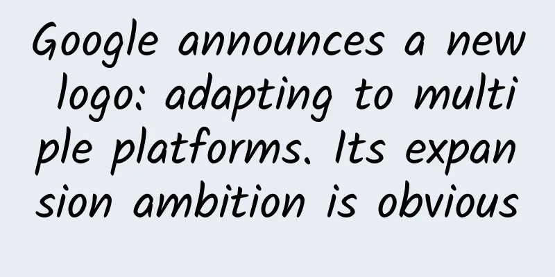
Google announces a new logo: adapting to multiple platforms. Its expansion ambition is obvious
|
On September 2, early this morning, Google suddenly announced the adoption of a new logo. The company said the purpose of this change is to adapt to multiple mobile smart terminals such as smartphones, watches, and cars. This change in Google's logo is also the largest change in the logo style since the company was founded in 1998. The new logo still has six letters "GOOGLE", but the font has been redesigned to adopt a sans-serif style, which is more rounded and modern. The simplified logo "g" of "GOOGLE" has also been changed to a "G" made of four colors. Google will gradually adopt the new logo in all its products. The following is the full text of Google's official blog: Google has changed a lot over the past 17 years—from the generations of our products to the way they look and feel. Today, we're changing again. So why are we making this change? There was a time when the only device people could access Google was a desktop computer. Today, people use Google products across a variety of platforms, apps, and devices throughout the day. You expect Google to help you wherever and whenever you need it, whether it's on your phone, TV, watch, dashboard in your car, and of course, your desktop! Today, we're introducing a new visual language that reflects this reality and shows you how Google can make magic happen on a small screen. You'll notice that we've changed the Google logo and branding, which were originally designed for a browser page on a single desktop computer, and have been continuously updated to adapt to a seamlessly connected world across countless devices and different types of input methods (such as touch, typing, and conversation). This not only shows that you are using Google, but also shows how Google works for you. For example, new elements like the colorful Google microphone icon help you recognize and interact with Google, whether you are talking, clicking or typing. At the same time, we said goodbye to the small blue "g" icon and replaced it with a symbol that is consistent with the overall logo. This isn't the first time we've changed our logo, and it certainly won't be the last, but we think today's update is a great example of how Google is serving you in different ways through Search, Maps, Gmail, Chrome, and more. We think the new Google logo is great (simple, clean, colorful, and friendly), and of course, we made these changes not just for Google today, but for Google's future.
Soon you’ll be able to see the new design across our different products. We hope you like the change! |
<<: Select pictures by imitating WeChat Moments
>>: Phoenix.com announces massive layoffs; established portals are transforming


Recommend
Named by experts to fight against Omicron, what is “vaccine adjuvant”?
With the arrival of Omicron and the increase in b...
The "Nuojiji" aliens 3,000 years ago? The "food rations" of the Shang Dynasty merchants from the oracle bone inscriptions
(Left: Oracle-bone script for the character “粟” (...
Obesity diagnosis and treatment now has a "national version of the guide"! 7 kinds of diet plans, see which one is right for you
On October 17, the National Health Commission iss...
Absolutely beautiful! One year after the Webb telescope was put into operation, these high-definition photos of the universe were taken!
Remember the tens of billions of dollars worth of...
E-commerce game design and planning techniques (Part 2)
The era of content-based e-commerce has quietly a...
“Curious” marketing: How to create virality?
Curiosity is one of the internal motivations for ...
A must-have for operations, promotion and marketing: a complete list of the latest hot topics in March 2018!
The 2018 Spring Festival holiday has ended, and t...
"Crackling" is the sound of the New Year, but can we set off fireworks during the Spring Festival?
...
Unexpectedly, this nut extract can prevent fat accumulation
Compiled by: Gong Zixin Obesity is a significant ...
International Day Against Drug Abuse and Illicit Trafficking丨How do drugs “kidnap” our minds?
Drugs not only damage physical health, but also l...
Who is this girl?
I believe you have seen such a girl in many place...
One food may cause 45 diseases! Doctors remind you not to eat more than this amount!
They all say it’s a “sweet burden”, but how heavy...
What happens if a male wasp without a stinger encounters a predator? | Nature Trumpet
Welcome to the 24th issue of the Nature Trumpet c...
10 bad habits that cancer cells love the most! If you don't pay attention, they will hollow out your body~
People always want to find some time and space fo...
With raw material shortages and high technological barriers, when will the chip shortage crisis be alleviated?
Last November, a piece of news appeared in the Pe...